Analytics
A professional responsive tool creating Custom RebusAi Dashboards, built using Bootstrap3, the most popular Backend-end framework for developing responsive, mobile first projects on the web.
1. Add an Item
Add a Dashboard Item
- Click on the ‘+Add’ Button on the top right corner of your Dashboard screen.
- Once you click on the ‘’ Button, you will be asked to select the Dashboard Item Type.
- Choose from the 10 item types as provided by Dashboard Ninja.

1.1 Tile
Create A Dashboard Item As A Tile
If you select the Dashboard Item Type as a Tile, a pop screen or a dashboard item creation window will appear as given below:

Note: The ones highlighted in purple are mandatory to fill. The Model field is the most important one to fill to save the dashboard item.
Category | Label | Description | Condition |
General | Name | Label which will be displayed on the tile | |
Model | Select the model/table on which you want to create your item | ||
Company | Display tile to a particular company | ||
Type | Select the type as ‘Tile’ | ||
Preview | Live Preview of the Tile at the right side |
Select the Model type to begin your dashboard creation process.

After selecting the Model, click on the ‘Edit Domain’ button to define the Domain for the Dashboard item.
For instance: If your Model is Sale Order, you can define the Domain as Sale Order where the total amount is greater than 100.


Once the Model is selected, you will notice five configurations further namely Data Display, Actions, Auto Update, & Advance Configuration.
1. Data
The ‘Data' tab allows users to add/select the data for which they wish to display the results.
Category | Label | Description | Condition |
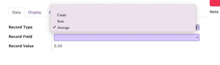
Data | Record Type | Allows you to show your data/record as a Count, Sum, or Average | |
Record Field | Allow you to select the field on which to apply the sum or average operation | It will only be visible when the Record Type is Sum or Average | |
Record Value | Display exact value depending upon selected Record Type and Record Field | ||
Domain | Allow you to add conditions to filter out your Data | This Odoo default widget is only available in Odoo 11, 12, 13, 14, & 15 versions. Odoo 10 customers will need technical knowledge to add conditions. | |
Date Filter Field | Field on which date filter will work | Only date fields will be displayed | |
Date Filter Selection | Select the Date filter for which you want to filter out your item records/data | If the None option is selected then only the Main Dashboard page date filter will work. | |
Start Date | Option to set a start date for the custom date filter | Only visible when Date filter selection is set to Custom Filter | |
End Date | Option to set an end date for the custom date filter | Only visible when Date filter selection is set to Custom Filter |
2. Display
The ‘Display’ tab will allow a user to configure the dashboard item on the basis of its color, layout, & more.

Category | Label | Description | Condition | |||
Display | Number System | Track the data in your format with the pre-defined four Number system options | ||||
Layout | Choose the Layout for your dashboard item from the 6 available sets: Layout 1, 2, 3, 4, 5, & 6 | |||||
Theme | A pre-configured set of 5 different colors i.e White, Blue, Green, Red, and Yellow. Select the Theme as per your choice | Get overridden if custom values are set in Background Color, Font Color & Icon Color | ||||
Background Color | Allows you to set the background color from a color pop-up window. Also provides an option to set transparency. | |||||
Font Color | Allows you to set the font color from a color pop-up window. Also provides an option to set transparency. | |||||
Icon Option |
|
| ||||
Icon | We have provided 29 pre-loaded Default Font Awesome 4.7.0 icons | Use the search bar to search for other available Font Awesome icons. | ||||
Icon Color | Allows you to choose the color of the icon. Also, provides an option to set transparency. | Only visible when Icon Option is chosen as Default | ||||
Top Button Colorful | Allows you to set the distinct color of Top Buttons of the Tile. Helps you to edit, remove, move, or duplicate from the Main Dashboard |
3. Actions
The ‘Actions’ tab will allow a user to perform the vital action on the chosen item.
A.

Category | Label | Description | Condition |
Actions | Client Action | Allow you to choose Client Item Action field | |
Client Item Action | Allows you to set the action of the item | Only visible when client action is selected | |
Item Action | Allows you to set the action of the item | Only visible when client action is not selected |
4.Advance Configuration

Category | Label | Description | Condition |
Advance Configuration | Apply Multiplier | Allows you to get results by applying a multiplying factor | |
Multiplier | Insert the number you wish your results to get multiplied by | Visible when ‘Apply Multiplier’ action is selected |
1.2 Bar Chart
Create A Dashboard Item As A Bar Chart
If you select the Dashboard Item Type as a Bar Chart, the ‘Data Calculation Type’ tab will appear.
Either you can select the ‘Default Query’ to get the dashboard results or select the ‘Custom Query’ to add custom chart values.

Category | Label | Description | Condition | |
General | Name | Label which will be displayed on the header of the item | ||
Model | Select the model/table on which you want to create your item | |||
Company | Display Bar Chart to a particular company | |||
Type | Select the type as Bar Chart | |||
Data Calculation Type | Allows you to create ‘Default Query’ or ‘Custom Query’ | Two Types
| ||
Preview | Live Preview of the Bar Chart |
1. Data
Once you select the Model, three important fields will appear:
- Measures
- Line Measure
- Data Type
The measures and Line Measure field will allow the user to select multiple values and corresponding to the selected fields, the dataset will start displaying for those values.
For instance:
Let’s select the:
- Model as Sales Order
- Measures as Total (sale.order), Taxes (sale.order) and Untaxed Amount(sale.order)
- Line Measure as Taxes (sale.order) and Untaxed Amount (sale.order) and Currency Rate (sale.order)
Measures and Line Measure will show a list of fields related to the chosen model on the basis of the following attributes:
- Type: Integer, Float, or Monitory
- Store: True i.e. this field value must be stored in the database.
Note: Field name “id” is not allowed to show explicitly.
Once you select the Data Type as Sum, Count, or Average, it will start displaying the data respectively.

You will notice the following configuration options under Group/Dimensions tab:
- Group By
- Sub Group By
- Sort By Field
- Sort Order
- Record Limit Data Visibility
Note: Group By and Sub Group By fields allow you to group your selected Measure field data.
While selecting the Group By or Sub Group By field, if you select the field type as Date/Datetime Type, then you will notice a new field start displaying, i.e “ Group By Date/Sub Group By Date ”
Group By Date/Sub Group By Date field will allow you to group your data as per the options available:
- Minute
- Hour
- Day
- Week
- Month
- Quarter
- Year
- Month-Year
Select the ‘Sub Group By’ Field to further group your ‘Group By Field’ data.
For example, select the:
- Group By as Customer (sale.order)
- Sub Group By as Company (sale.order)
You can also select the Sort By Field, Sort Order, and Record Limit options specific to the dashboard item you’re currently making.

Category | Label | Description | Condition |
Data | Measures | Allows you to select the fields for which you want to perform the calculations as per the selected Model | Only visible when Data type is Sum or Average |
Line Measure | Allows you to select the fields for which you want to display lines on the Bar Chart | Only visible when Data type is Sum or Average | |
Data Type | Allows you to display your data as Sum, Count, or Average | ||
Group By | Allows you to group your selected Measure fields data | ||
Group By Date | Allows you to select the date option by which you wish to group the data. Options are Minute, Hour, Day, Week, Month, Quarter, Year, & Month-Year. | Only visible when Date/DateTime field is chosen in Group By | |
Sub Group By | Allows you to further group your Group By field data. | ||
Sub Group By Date | Allows you to select the date option by which you wish to group the data. Options are Minute, Hour, Day, Week, Month, Quarter, & Year. | Only visible when Date/DateTime field is chosen in Sub Group By | |
Sort By Field | It will allow you to select the field on which you want to sort the records/Data | ||
Sort Order | Allows you to sort your data in Ascending or Descending order | ||
Record Limit | Allows you to set limits to your records/data | Appear when the ‘Record Limit Data Visibility’ option is selected | |
Domain | Allows you to add conditions to filter out your Data | This Odoo default widget is only available in Odoo 11, 12, 13, 14, & 15 versions. Odoo 10 customers will need technical knowledge to add conditions. | |
Date Filter Field | Field on which date filter will work | Only date fields will be displayed | |
Date Filter Selection | Select the Date filter for which you want to filter out your item records/data | If the None option is selected then only the Main Dashboard page date filter will work. | |
Start Date | Option to set a start date for the custom date filter | Only visible when Date filter selection is set to Custom Filter | |
End Date | Option to set an end date for the custom date filter | Only visible when Date filter selection is set to Custom Filter |
2. Display

Category | Label | Description | Condition |
Display | Number System | Track the data in your format with the pre-defined four Number system options | |
Chart Color Palette | It will allow you to select the color from 4 pre-defined options: Default, Cool, Warm & Neon | ||
Stacked Bar Chart | The results will appear in a stacked form, one above the another | ||
Show Data Value | Read the graph easily by selecting the ‘Show Data Value’ | ||
Show Custom Unit | Display the custom unit in the Bar Chart | Only appear when ‘Show Custom Unit’ is selected | |
Select Unit Type | Choose Unit type as Monetary or Custom | Only appear when ‘Show Custom Unit’ is selected |
3. Actions

Category | Label | Description | Condition |
Actions | Action lines | Allow you to choose different data at a time to perform an action, to go in deep you can choose the number of lines as per your need | This field is applicable on every type except Tile, KPI, and List |
Client Action | Allows you to set the client action on the item, chosen by the client | Only visible when client action is selected | |
Client Item Action | Allows you to set the action of the item | Only visible when client action is selected | |
Item Action | Allows you to set the action of the item | Item Action |
4. Advance Configuration
Category | Label | Description | Condition |
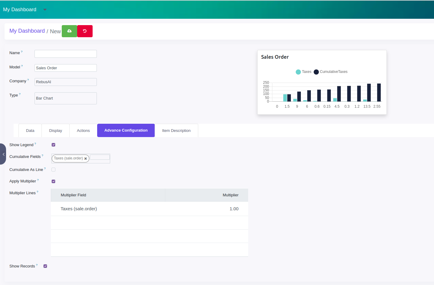
Advance Configuration | Show Legend | Show or hide a bar chart legend | Appears when ‘Show Legend’ is enabled |
Cumulative Field | A user can see information acquired over a period of time using the Cumulative Field option | ||
Cumulative As Line | A user can see information acquired over a period of time as a line using the ‘Cumulative As Line’ option | ||
Show Records | To display records of your data, select the ‘Show Records’ option | ||
Apply Multiplier | Allows you to get results by applying a multiplying factor | ||
Multiplier Lines | Insert the number you wish your results to get multiplied by | Visible when ‘Apply Multiplier’ action is selected |
1.3 KPI
Create a Dashboard Item as a KPI
You can create some amazing KPI with the below comparison options:
KPI with Target
KPI with Previous Period
KPI with Target and Previous Period
You also get an option of the additional query using which you can perform different operations using the "Data Calculation" field on two result sets along with Target comparison:
- None/Comparison
- Sum
- Ratio
- Percentage
Category | Label | Description | Condition |
General | Name | Label which will be displayed on the tile | |
Model | Select the model/table on which you want to create your item | ||
Company | Display KPI to a particular company | ||
Type | Select the type as KPI | ||
Preview | Live Preview of the KPI | ||
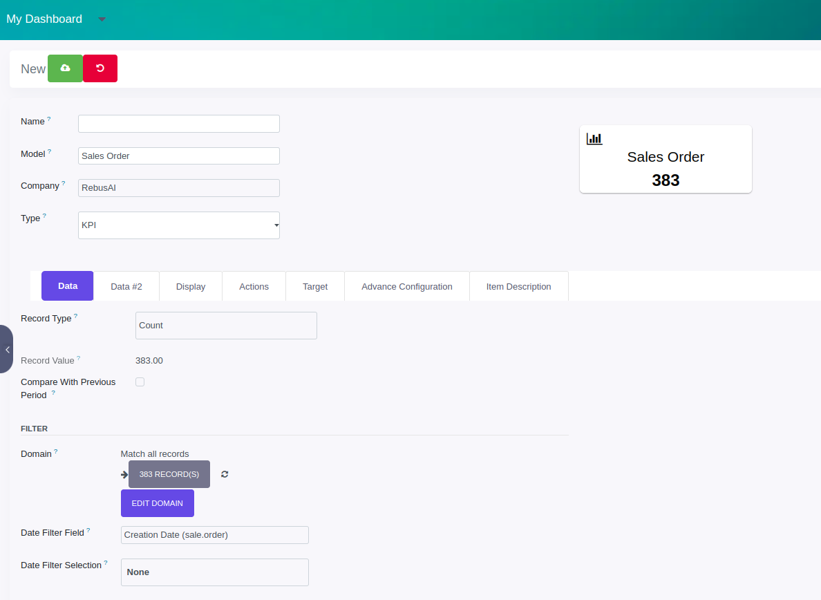
Data | Record Type | Allows you to show your data/record as a Count, Sum, or Average | |
Record Field | Allow you to select the field on which to apply the sum or average operation | It will only be visible when the Record Type is Sum or Average | |
Record Value | Display exact value depending upon selected Record Type and Record Field | ||
Previous Period | Show/Hide previous period value | ||
Domain | Allow you to add conditions to filter out your Data | This Odoo default widget is only available in Odoo 11, 12, 13, 14, & 15 versions. Odoo 10 customers will need technical knowledge to add conditions. | |
Date Filter Field | Field on which date filter will work | Only date fields will be displayed | |
Date Filter Selection | Select the Date filter for which you want to filter out your item records/data | If the None option is selected then only the Main Dashboard page date filter will work. | |
Start Date | Option to set a start date for the custom date filter | Only visible when Date filter selection is set to Custom Filter | |
End Date | Option to set an end date for the custom date filter | Only visible when Date filter selection is set to Custom Filter | |
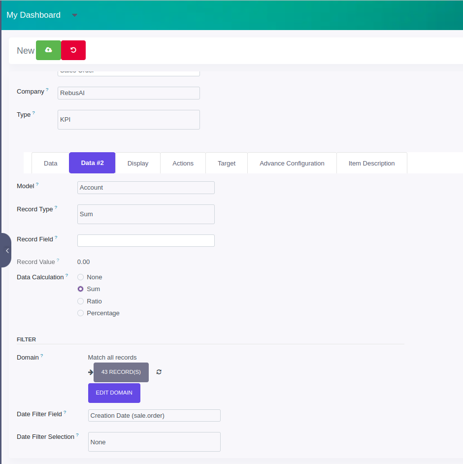
Data #2 | Model | Select the model/table on which you want to create your item | |
Record Type | Allows you to show your data/record as a Count, Sum, or Average | ||
Record Field | Allow you to select the field on which to apply the sum or average operation | It will only be visible when the Record Type is Sum or Average | |
Data Calculation | 4 options for the calculation of Data and Data #2 result set. Options are None, Sum, Ratio, Percentage. | Target value displays only when Sum and Percentage is selected | |
Domain | Allow you to add conditions to filter out your Data | This Odoo default widget is only available in Odoo 11, 12,13, 14, &15 versions. Odoo 10 customers will need technical knowledge to add conditions. | |
Date Filter Field | Field on which date filter will work | Only date fields will be displayed | |
Date Filter Selection | Select the Date filter for which you want to filter out your item records/data | If the None option is selected then only the Main Dashboard page date filter will work. | |
Start Date | Option to set a start date for the custom date filter | Only visible when Date filter selection is set to Custom Filter | |
End Date | Option to set an end date for the custom date filter | Only visible when Date filter selection is set to Custom Filter |
1.4 Other Diagrams
Same as Tile and Bar chart